
Sharmaji Studio required a structured brand identity system that aligned with a product-focused design practice. The previous visual presence lacked hierarchy consistency and scalable application logic across digital and print touchpoints. The rebrand focused on building a structured identity system that could scale with product growth and cross-platform application.
- Create a distinct, minimal logo system that works across all touchpoints.
- Establish a cohesive visual identity that feels modern but timeless.
- Define a core brand system — color, typography, iconography.
- Extend branding into merch, stationery, lanyards, and other physical assets.
- Keep the entire system light, scalable, and practical for a growing design studio.
Objective
Design a scalable identity system that reflects product maturity and system thinking.
Primary Goals:
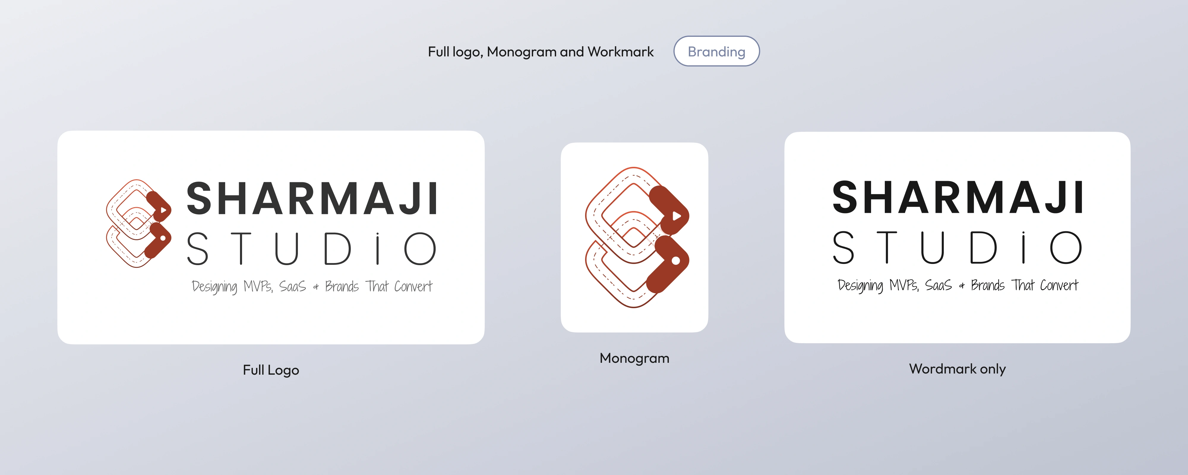
- Establish a recognizable monogram that functions independently at small sizes.
- Create a typographic hierarchy optimized for digital-first usage.
- Build a restrained color system to maintain credibility across B2B contexts.
- Ensure adaptability across web, merchandise, and documentation.
Brand Guidelines
Visual Language
- Geometric precision to reflect structured thinking.
- Controlled color contrast to maintain focus.
- Clear typographic hierarchy for digital legibility.
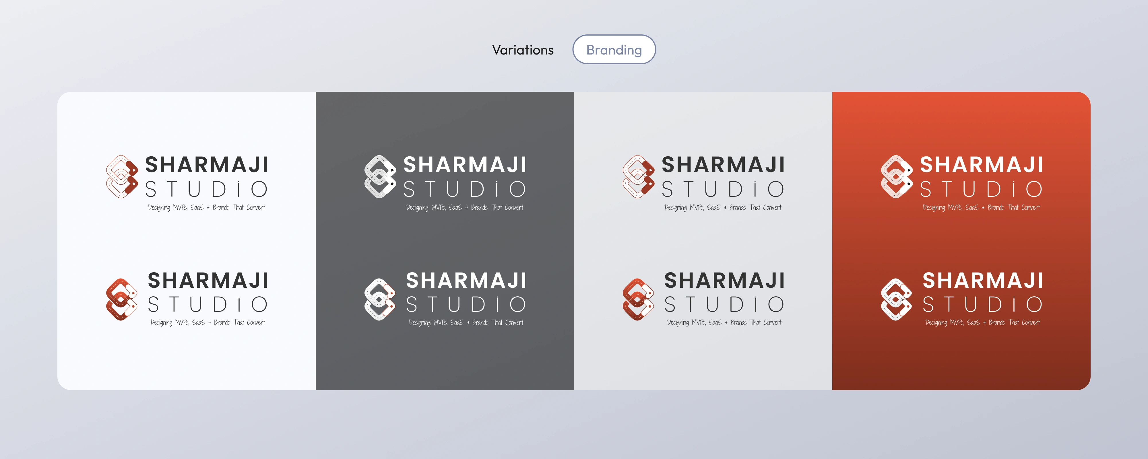
- Scalable system behavior across formats and surfaces.
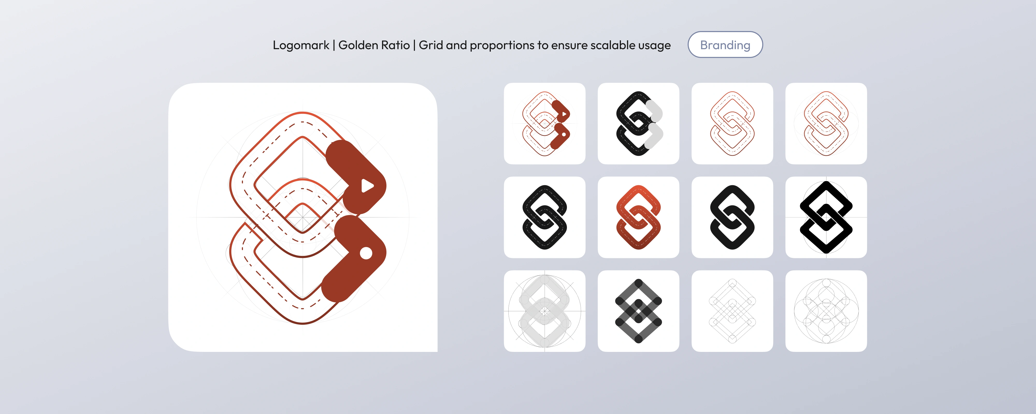
The logomark was constructed using proportional grid logic to ensure visual balance at multiple scales. Geometry was prioritized over ornamentation to maintain structural integrity in both large-format and favicon usage.
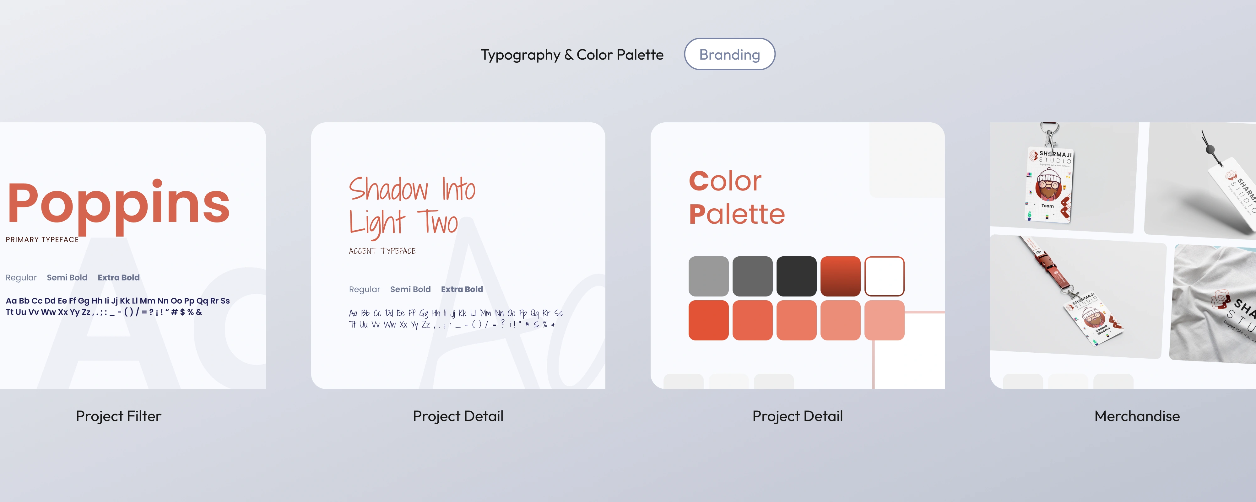
Typography & Color
Typography was selected based on clarity at multiple breakpoints. Poppins establishes structural hierarchy, while the accent typeface introduces controlled personality without compromising readability.
The color palette balances neutral credibility with a strong primary accent to support call-to-action emphasis without overwhelming layouts.
Brand Guidelines
Outcome
- Established a cohesive identity system adaptable across digital and physical environments.
- Standardized visual behavior across digital and physical touchpoints to reduce fragmentation.
- Created a modular brand structure ready for future expansion.
Next Steps
- Expand into motion identity for digital campaigns.
- Build a design system for the website & marketing assets.
- Standardize templates for outreach, decks, and merch.
Final Note
This identity system prioritizes structure over ornamentation, ensuring longevity, consistency, and operational clarity as the studio evolves. Every element was designed to scale, adapt, and support long-term brand evolution without visual inconsistency.